Bavanco
About
Welcome to the Bavanco website.
Over the years this website has taken on many forms. (If you are interested, you can view the full back catalogue in the Bavanco archives). This current incarnation, as you can probably tell, is based upon the title deed cards of a Monopoly set.
Community Chest
Bavanco archives
Community Chest
in a beauty contest
collect £10
Community Chest
Pay £50
But not just any Monopoly set. If you own a fairly recent version you might notice some subtle differences in the graphic design. If you own anything other than a London based set, you’ll almost certainly notice some differences. This site specifically pays homage to a English set from the 1950’s.
Why?
Because that is the set my dad owned as a child and the same set that was passed down to me and my siblings when we were young. We grew up playing this mid-century version and it was all we knew.
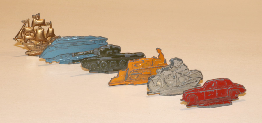
Our friends might want to be the iron or the Scottie dog. But from our selection of post-war pieces, we could choose from such tokens as the bulldozer, the Golden Hind or the tank! My brother would usually pick the headless man on a motorbike, although I think that was only available in our set.
The Redesign
The redesign of this website hopes to capture the graphic design styles seen in that old post-war monopoly set. I like how those styles tend to leak the technical nature of their creator.
Some of the more unique and quirky elements I've noticed include; large word spacing, the plentiful use of ditto marks and emphasizing text by use of capitalization instead of bold text. I’m guessing it was just easier to use uppercase letters than it would have been to switch to a bolder typeface.
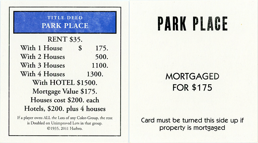
For my site, I have used Monopoly title deed cards to act as links to the various pages of the website. Historically I’ve used something like a drop-down menu but in recent years, "card design" has been a popular website navigation trend and I've decided to embrace it.
I decided to implement card design using some of my favourite cards; title deed cards. By rendering the cards with HTML and CSS, instead of using an image, I can dynamically control the content that appears on the cards.
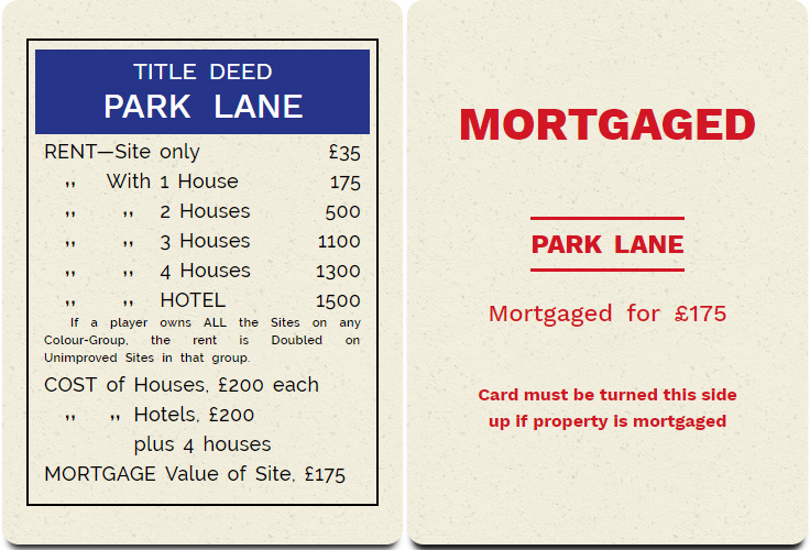
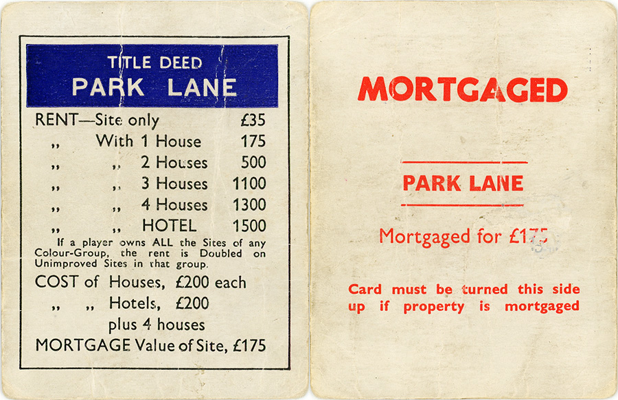
Comparing my reproduction with the originals, hopefully you agree, the likeness is pretty spot on. The only real difference is the discolouring and the wear and tear on the 60-year-old original.
Chance
deck of monoply title deed cards
rendered in CSS
Chance
Chance
crossword competition
collect £100
Modern Design
To reinforce my opinion that graphic design has lost some character over the years, let’s compare some modern designs.
First off, a title deed card from my 1990’s European Edition.
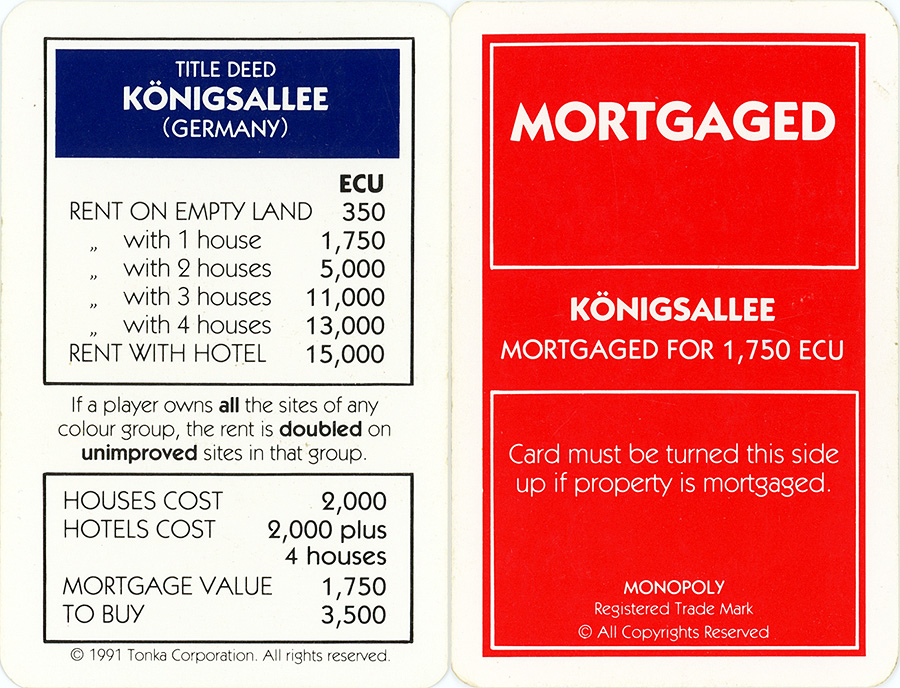
Overall, its looks pretty smart and I don't have any real issues with its appearance. It is however, clearly designed on computer, so right away you lose some of the inconsistencies and quirks that give the old cards their character. The typeface looks good when bold, but I don't like the light variant. There are less ditto marks and less capitalization. The information on the card looks more cramped and there is visibly less white space. The addition of trademarks and copyrights changes the tone. I do enjoy the striking red mortgaged side of the card though.
Moving on to my 2010's American version.
Hard to know where to start with this version.
The cards have lost all their character and become bland and generic.
Some of the issues include, but are not limited to; the colour header now has an ugly black border, the beautiful dark shade of blue is gone, a generic serif typeface reduces the cleanness, everything is centre justified which might be why the dollar amounts don't line up!, all of the ditto marks are gone and the mortgaged side is very boring and basic and doesn't even feature any red.
Overall, it just looks like it has been thrown together by an intern using Microsoft Word. None of the personality of the creator comes through.
Summary
Something about that early 1950 graphic design appeals to me greatly. I see the same styles in old London Underground signs from the same era.
It's sad that with all the modern advancements, we’ve ended up, in my opinion, with an inferior design. That said, we can still celebrate the past and pine over the nostalgia. The Bavanco website fully embraces quirky design and is happy to pay tribute to a masterpiece. Enjoy.
Community Chest
Community Chest
in a beauty contest
collect £10
Community Chest
Pay £50